Skip to content
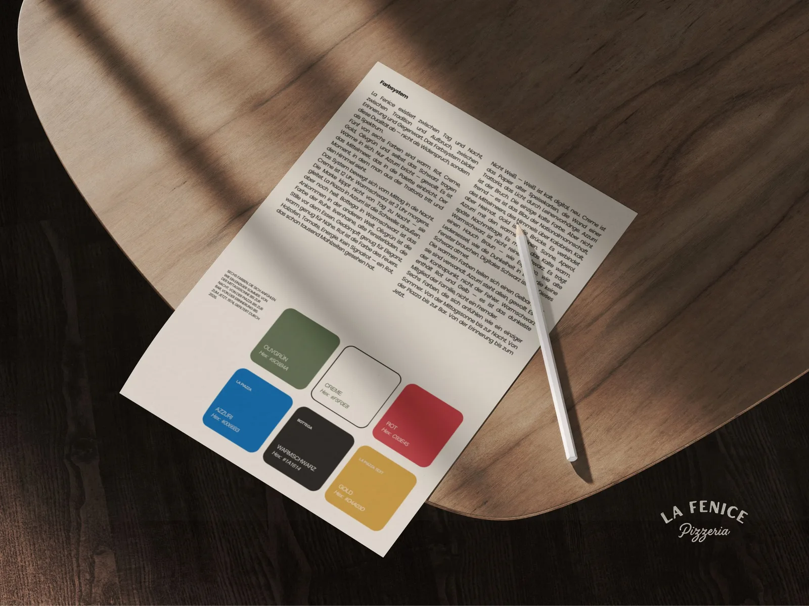
La Fenice brand system with colours and printed materials on a wooden table
Case Study · Brand System · Digital

La Fenice

A Calabrian family returns to Bavaria. The task goes beyond opening a restaurant: building a brand around what brings them together.

ClientThe Lopez family
ScopeBrand system · Web design · Development
DeliverablesPlaybook · Website · Menu system
Location & yearErding · 2026

Starting point

A family with Calabrian roots and hospitality experience in Bavaria comes back together. The new venture needs a shared brand identity and a way to keep information consistent online and in the restaurant.

My contribution

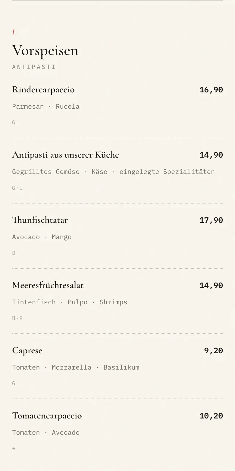
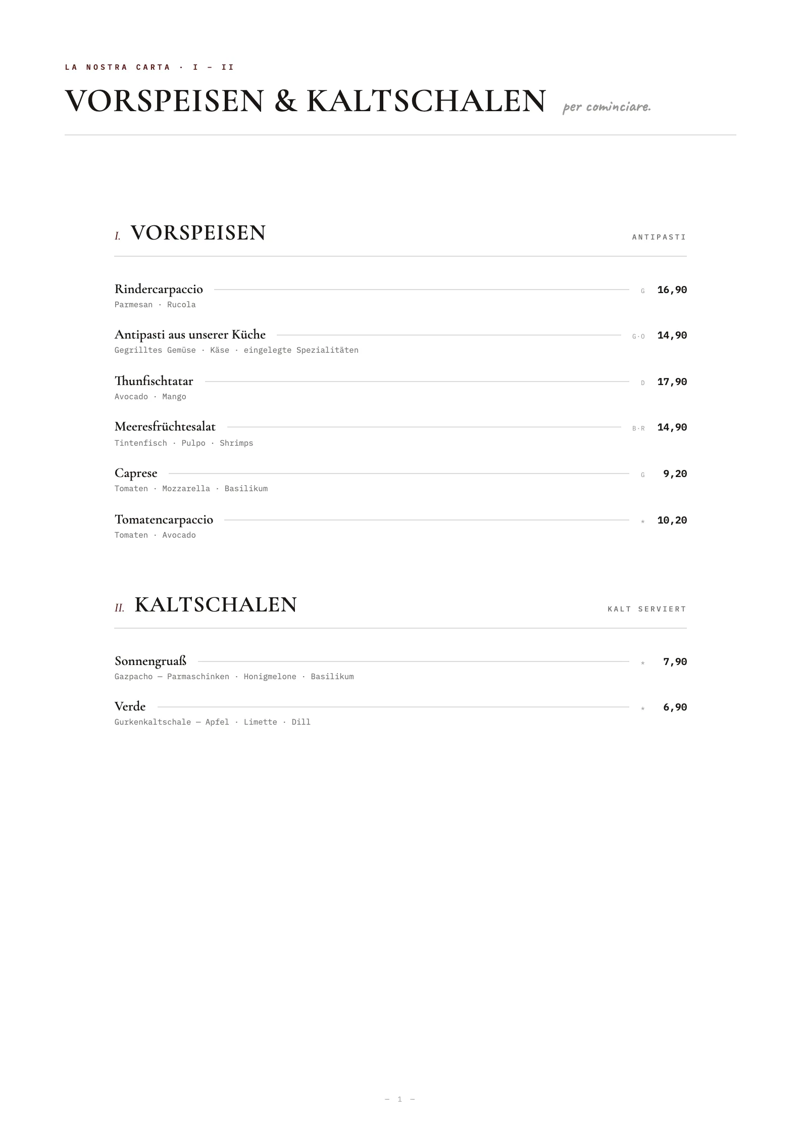
I developed the brand system, designed and built the website, and automated menu production. The website and print layouts draw from the same data source.

What this enables

Guests can discover the restaurant, browse the menu and reach the reservation page. Dishes and prices are maintained centrally and published to web and print, rather than editing each version separately.

The idea

People follow
more than products.
They follow
stories.

In Venice, an opera house is called La Fenice: the phoenix. Twice destroyed by fire, twice rebuilt. Not because it was easy, but because some things matter too much to let go.

The Lopez family knows that story. From Calabria to Bavaria, decades running a pizzeria, then separate paths, and a return to the same table at the end of 2025. The task was never simply social-media reach. It was to make their story tangible: values, aesthetics, atmosphere and roots. Everything a family from Rocca di Neto brought to Bavaria.

The strongest brands can feel less like brands and more like people, characters and stories. That was the thinking behind La Fenice.

A brand system does not have to invent anything. At its best, it captures what is already there and makes it repeatable, so it is not lost in everyday use.

Positioning

The competition is not who you think.

The positioning needed to move beyond comparing menus and prices. The family's story became the starting point: their roots, their hospitality and their own perspective on Italian food.

La Fenice is not just competing with the Italian restaurants in Erding. It is competing with the sofa at home.

The real question is not ‘Why La Fenice rather than the pizzeria next door?’ It is ‘Why go out tonight at all?’ That shift informs every decision, from the space to the imagery and the voice. La Fenice needs to offer an experience people cannot have at home.

Brand architecture

A family of brands.

Three worlds sit under the La Fenice name, from lunchtime into the night. Each has its own role, voice and imagery, with two more concepts in development.

01 · The hearth

Pizzeria La Fenice

A wood-fired oven, Salvatore's recipes and Giuseppe's craft. Relaxed, warm and lively, in terracotta.

02 · The village square

La Piazza

Up to 700 seats beneath chestnut trees. Aperol and brass bands in summer; mulled wine and lights in winter.

03 · The night

Bottega

Club, bar, nightlife. A different world: warm black, restrained and monochrome.

La Fenice seal with an etched phoenix
The sealMaster brand
Pizzeria La Fenice wordmark in terracotta
Pizzeria La FeniceWordmark
La Piazza wordmark in gold
La PiazzaWordmark
The visual system

Six colours. Day and night. One family.

Neither pure black nor pure white. Everything is slightly softened, warm and tactile. Colour signals which world you are in: day or night, without a word of explanation.

Cream#F5F0E8Paper, walls, light
Warm black#1A1614Type, floors, night
Terracotta#C93E45Fire
Olive green#5C6B4ANature, calm
Azzurri#0066B3Sky, sea
Gold#D4A03DSun, brass
The voice

Like a friend inviting you over.

Not like a restaurant making a sales pitch. Short and informal. Italian for the food, German for everything else. Show the feeling rather than describing it.

Before

We look forward to welcoming you this Thursday evening from 9 pm!

After

Thursday. 9 pm. We're here.

Before

We are delighted to present our new menu.

After

New menu. Come try it.

‘Like the old days. Only better.’

Digital presence

The experience starts before the first visit.

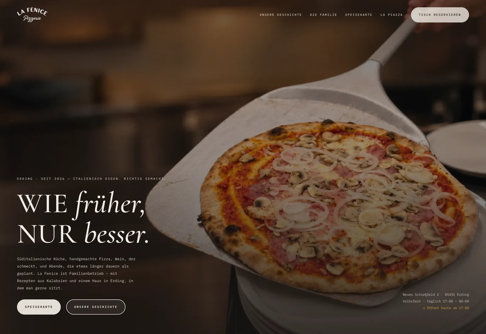
I designed and developed lafenice-erding.de in full. The website translates the brand system into a clear path for guests: meet the family, get a feel for the restaurant, read the menu and reserve a table.

Imagery, typography and language carry the same personality as the venue. The restaurant and Piazza have their own entry points. Menus, opening hours and reservations remain easy to reach on a phone.

The La Fenice website designed by Seethaler Studio, with pizza, the wordmark and the German headline meaning Like the old days, only better
Web design and development: a digital home for the brand, with clear paths to menus and reservations.
Visit lafenice-erding.de
The outcome

The launch.

The first reel reached almost 70,000 views in two days. The family's story gave the new presence a tangible starting point that people could connect with and share.

~70,000
First reel views
303,224
Views in 30 days
+2,930
Net new followers
The foundation

The brand opens the door.
The family makes people stay.

The family has a design framework it can carry forward, a digital path for guests and a shared source for its menus. New content and price changes can build on that foundation without redesigning the presence each time.

Next projectPositioning & Growthtermbase.io